|
Decorating with Color is a Quick and Easy update for Your Home
Decorating with Color is the Fastest Way to Express YOUR Personal Style in YOUR Home
Decorating with color After all, if you are simply painting a room, you can always change the color if the one you choose proves to be a bad decision. Been there, done that! Of course being aware that you can go over board is also smart too. Collect lots of color chips and decide on a color palette for several adjoining rooms before you make a mistake. Read books such as Decorating and Painting Books and ebooks
Here are some suggestions for Reading about Decorating with Color
Take a color from one room and add it to the other room that is close by for a better color flow through your home. More on that later. Keep reading to find out what I mean. I have added several photos on this page so you can see the colors that I am referring to. These paint colors are available at Lowe's.
No more Builder Biege!This pillows are a good example of how cheerful Decorating with Color can be! They wake you up when you see them on the page!
~~~~~~~~~~~~~~~~~~~~~~~~~~~~~~~~~~~~~~~~~~~~~~~~~~~~~~~~~~~~~~~~
Paint Color Cheat Sheets"The Fastest and Easiest Way to Find the Right Paint Color" Click Here!
Valuable information about how to use colors when Painting, written by professionals in the field!
Check out Paint Color Cheat Sheets before you spend valuable time and money choosing the wrong colors if you are in doubt! The ebook costs less than one gallon of the wrong color of paint! ~~~~~~~~~~~~~~~~~~~~~~~~~~~~~~~~~~~~~~~~~~~~~~~~~~~~~~~~~~~~~~~~
For Instant Color in any Room, Try adding a Wall mural. Click on the banner below for full details!When a builder builds a new model home, most of the time the paint colors are left very neutral. ( I cannot even spell neutral or beige without using spell check)! I have no problem spelling decorating with color! I am not kidding there, really I had to use spell check on both words! I just love the impact that color can make on a home. The only times I have ever had beige walls was when I rented short term and new that the colors I wanted to paint the house would not be approved colors. I did not waste the money or the energy. I moved out in less time than it would have taken to paint the entire place! But I have changed the colors of rented homes too. I simply get way to bored with white walls. And I really enjoy decorating with color.
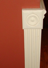
OK, there is a place for biege, - maybeIf you do use alot of color in your home, and then decide to sell the house, you would probably benefit from painting the walls a neutral color at that time. Your taste in color is a personal choice, so,to speed up the sell make it neutral and follow these Home Staging Tips and also get rid of things you no longer have to have by declutterling your home too. Back to the topic of COLOR!When I moved in this house the only rooms that were not white was on bedroom and the kitchen, and the foyer. My husband felt that white was a good safe choice for the walls. He had a fear of decorating with color, alot of people do. Well, that is not MY taste, and I did not share the fear, so guess what? We started making changes. I moved in the house in December and we spent that entire winter working on changes to the main level of the house. We made lots of changes, but the one that made the biggest impact quickly was when we started decorating with colors through out the house. We painted all of the bedrooms, the kitchen, bathrooms and living and dining room. Like I said we, made lots of other changes too, such as adding lots of Architechural Molding through out the house as we updated the rooms with new floors and paint. We removed all of the carpet, had new carpet installed in the bedrooms and added new laminate floors in the main areas. It was alot of work, but the finished product was a major improvement. And it reflected our style. The house was becoming our home together. That is very important, for several reasons. My choice in decorating with colors was anything except white. I chose earth tones and neutrals. We painted all of the trim and doors on the main floor the same color. This was to make it flow from room to room better. The color chosen was a neutral tone - called vanilla bean. It goes with every other color except white....that works for me! We added alot of new trim as we updated and painted. We started making our color changes in one of the bedrooms first. We painted the bottom 1/3 of the room the vanilla bean color and added chair rail moulding. Then the remaining areas of the bedroom walls were painted apple green.
This room is a sunny room with a large window that lets in alot of natural light. The color is beautiful and works perfectly with antique ivory furniture that is in the room. The accent color used in drapes and pillows is dark purple. It looks like spring time in the bedroom. I love it. So the colors are ivory, apple green and purple. The next room to get a color make over was the kitchen. When I told my husband the color I was thinking about he was concerned to say the least. But he had seen how good the other room turned out so he decided to trust me. The kitchen was painted a pale yellow color at the time and I don't do pale colors! The cabinets are oak, so a med brown, the new appliances were sliver. The cabinet hardware was changed to match the appliances. (An amazing and inexpensive update)! The floor was a cream color, (that is on the list of changes to be made) and the counter tops are a neutral charcoal gray color. Back splashes are also cream color. (eventually the floor, countertops and backsplash will all be changed. They are all still in good condition, so we have made other home improvements first. I had alot of accessories for the kitchen countertops that also helped to make the color decision easier for me. I had a bowl and some plates and a platter that I like to display. I also had alot of
Rooster Decor Items that I wanted to use in the Kitchen
Take a color from an item you love, and intend to use in the spaceThe paint color I chose for the Kitchen was Purple Potion. The color is like the inside color of the bowl and other serving pieces I have. It is a deep purple color, not a pale lilac or lavender. 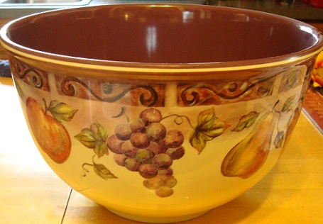
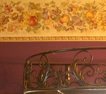
See the photo on the right of the bowl I am referring too. The border chosen to go in the kitchen was a fruit pattern that also matched the bowl and purple paint color. Notice the photo above on the left. Decorating with color like this turned out nice with the rooster decor .We also added an antique cabinet that we had restored in the kitchen. The cabinet was painted apple green and antiqued in vanilla bean. It is a bright and colorful additon to the room and goes great with the purple walls. To see the cabinet and accessories in the kitchen, go here SO, are you able to see that I have used the same colors in 2 different rooms that are on the same level of the house? Decorating with color in this way helps to tie the spaces together. They are not adjoining rooms, but they are not far apart. The main color of the bedroom, (apple green) is an accent color in the kitchen. The accent color in the bedroom (purple) is the main color in the kitchen. UPDATE the kitchen has been repainted during a recent renovation. It is now painted picnic basket like the other side of the wall. And it looks great! And both rooms share vanilla bean on the trim and doors. The area that adjoins these 2 spaces is the hallway. The doors and trim in the hallway are painted vanilla bean just like the other 2 rooms.
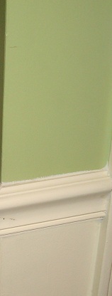
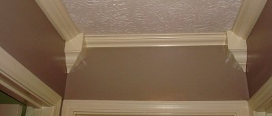
And it adds texture, which is more appealing than plain. Crown molding was also added. It is painted the same color (vanilla bean) as the other trim. The new color introduced in the hallway area is picnic basket. Picnic basket is a dark taupe color. (Look at the first photo on this page to see another photo of picnic basket). It is a great color that goes well with the earth tones I have combined with it.
It is a neutral color. It is painted in the hallway above the wainscoting. This combination of colors was used in the living room and dining room areas of the house. The wainscoting was continued on the wall that surrounds the kitchen (livingroom and dining room side). The photo on the left shows the corner that the colors come together at. This photo is darker than it should be. See the other photo of the brick6 color with the vanilla beacn colored trim to see the true color.
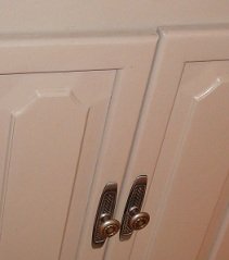
Then all of the walls that are the outside walls (the walls with windows and doors was painted a new color. The new color is called brick 6. See photos. (There are several shades of brick ) 6 being a darker shade, 1 being the lightest shade. The brick color was used in the split foyer and contined down the stairway. The hall bathroom, has vanilla bean wainscoting and chair rail moulding. The vanity is painted - picnic basket. (yes the same color as the hallway). See the photo on the right below of the vanity doors. One way to save money during renovations is to restore pieces instead of replace them. That is what we did with this vanity.
This again makes the spaces flow better. The floor is the same laminate as the hallway and living room areas. This helps to make the space feel larger. We chose laminate floors over hardwood because we have large dogs that spend alot of time indoors. Hardwood floors are easily damaged by their claws. The laminate works great for active families with pets.
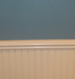
The new color for the walls in the hall bathroom above the wainscoting is meditation blue. It looks great with the vanilla bean and picnic baskets tones of cream and taupe carried in the room from the hallway. Other bedroom and bathroom colors used on the main floor also continue with the vanilla bean color as the trim color and include various shades of brown tones and rust and ocean. So the look is earthy and not loud, but not boring either. No rooms are painted white, or beige. Downstairs in the newly remodeled basement The brick 6 color continues down the stairway and wraps around one wall in the family room. The trim colors in the basement are wood(gunstock) and black. The main paint color is slate green on the walls in the family room and office. The laminate floors are Brazilian cherry ( similar to gunstock).
The paint colors in the family room and office are slate green. As seen in this photo
The main paint color in the laundry room is called cattail. It blends perfectly with the colors in the tile on the floor in the office and laundry room. The tile is canyon slate, which has brick , slate green and cattail(greenish gold)and taupe, swirls of color through out the tile surface. The black and wood trim is used in the office and laundry room too. The other new introduction to the area is antique reclaimed barnwood used as wainscoting in the office. The 3 rooms in the basement that are now finished work out great together with the colors chosen for the spaces. And they continue the main color of the living room and foyer into the basement. The furniture in one of the bedrooms upstairs is black. So the introduction of black trim downstairs is not a solitary use. The whole point of why I am giving these decorating with color details, is to express how taking some of the color from one room and using it in another room helps to unify the spaces. It is also great to be able to use accessories from one room in another room with you decide to do some redecorating. When you decorate with color in the ways that I have it, is easy to mix and match the accessories.
The main foyer has hardwood floor that is going to be updated to the same canyon slate tile that is used downstairs. The family room downstairs also has touches of purple accents in the room, In items such as a throw on a chair, candle sticks and a few accessories. The purple color looks nice with the slate green walls. Purple is my favorite color. I am happy to use it inside my home. What is your favorite color? Can you now get inspired to use it on YOUR home too? Go for it! and enjoy the amazing results you will get while decorating with color in your home too. See Photos of our decorating with color examples in our family room here. I highly suggest making updates to your home by decorating with color! Give it a try today. More Helpful Resources for Decorating with Color~~~~~~~~~~~~~~~~~~~~~~~~~~~~~~~~~~~~~~~~~~~~~~~~~~~~~~~~~~~~~~~~
Interior Painting GuideA very large part of maintaining our houses is having it repainted every once in a while and that is very applicable when it comes to interior house painting. While the task itself is not actually that hard, you can still make it a lot easier if you follow some tips and tricks. Not only will these tips make the job easier, it will make it easier for you to cleanse whatever messes could be made after. The problem is that, some people still think of this as a big issue, maybe because a lot of them are just scared to paint their houses. So to help you make interior house painting much easier, here are some useful tips. Much, much more can be found in the comprehensive "Interior Painting Guide" Click Here!
Prepping the RoomLet me emphasize first that good surface preparation is essential to every professional painting job. The most expensive paint, the best painting technique and the finest brush can't compensate for poor surface prep. Doing a good job of painting preparation actually saves painting time. Once you've learned good preparation procedures, painting is a much easier task. Begin by making a quick survey of the work required, step back and look at each room you are planning to paint as if you were seeing it for the first time. You may notice flaws you have learned to overlook but now have a chance to remedy. Use a broom and a spackle blade as you make this survey. While looking over the walls and ceiling, sweep the broom along the baseboards and above the door jambs and window casings. Then check for spider webs along the ceiling and in corners. Sweep them off. Use the spackle blade to probe peeling paint, deteriorated plaster, cracked wallboard and rotted trim.
Rolling the WallsThe rolling technique for painting walls and ceilings is similar. You can work in 3-ft. squares, which is about the coverage of a single roller-load of paint. The first stroke made with a freshly loaded roller should be away from you. Then you need to distribute the thickest part of the paint evenly over the square. On walls, it's best to make an "M" pattern. To avoid roller marks, make the pattern without lifting the roller. To fill in, work the roller back and forth without lifting it off the surface. Dip the roller again and do the same pattern and fill-in on the bottom 3-ft section, blending into the top section. Get more information at Click Here!
~~~~~~~~~~~~~~~~~~~~~~~~~~~~~~~~~~~~~~~~~~~~~~~~~~~~~~~~~~~~~~~~
|

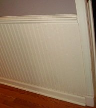 Bead board wainscoting and chair rail molding was added to the hallway. It is also painted vanilla bean. This breaks up that long narrow long that hallways have.
 The hall bathroom mentioned earlier was painted a new color. Actually that bathroom had a major makeover. New tub and shower combination, new walls with trim and new floor.


SAVE MONEY WHEN YOUSHOP OUR SPECIALTY STORESFOR YOUR HEALTH & YOUR HOME AND GARDEN NEEDS
Moringa Pills, Powder and Tea, & Diet and Nutrition Products
Shop our Appliances and Electronics Store
Shop our Book Store, for Books and Magazines
Shop Our Furniture and Home Decor Store
Shop Our Garden Decor and for the Birds Store
Shop Our Kindle Store for Ereaders and Ebooks
Shop Our Backyard Living Store, for Firepits, Grills, Patio Furniture & more
Shop Our Halloween Store for Decorations and Costumes
Shop Our Home Improvement Store For Hardware
Shop Our Christmas Decorations Store
Shop Our Lighting Store For Inside and Out
Shop Our Home Improvement Store For Tools & Building Supplies
Shop for Your Basement Rec Room, Bars , Tools and Accessories